The seat
One pattern. Four surfaces. A lot of people.
Birdeye
Design strategy across setup, Insights, Reviews, and Social
3 lead designers · 3 PMs · ~22 engineers
I led the design strategy and kept three PM tracks on a single competitive-intelligence pattern. The business case was a bundle: Competitors sold with Insights, as one higher-value offer. The design job was the seam.
Why it was quiet
Data-rich, unused, and annoying to set up.
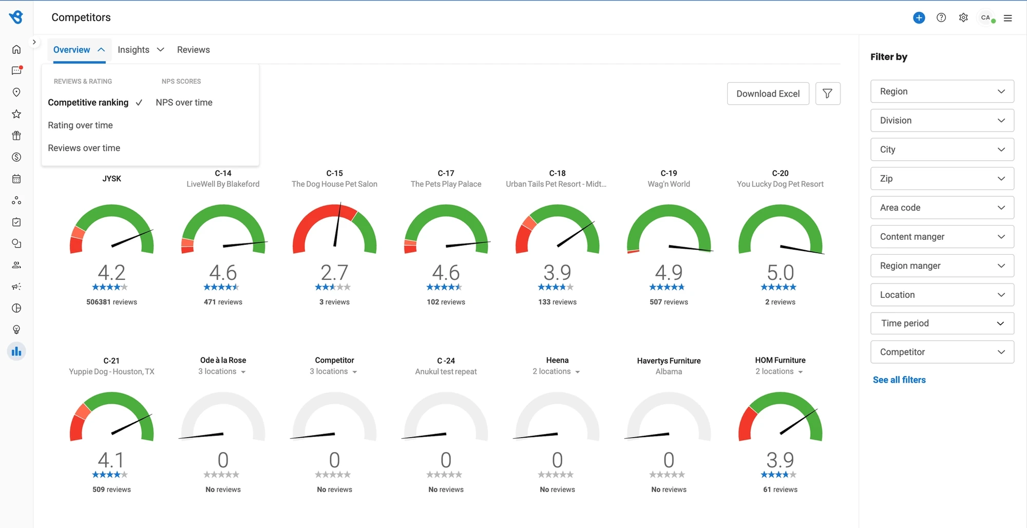
The old competitor module had lower engagement and lower sales than the rest of the platform. One page. A dial per competitor for review sentiment and star rating. Plenty of data, hard to consume. Setup was manual and tedious, which made adoption worse.
Re-imagine the competitor experience so mid-market and enterprise customers feel the value, and so sales can attach it to Insights.
We studied Sprout Social, Yext, and Podium for how competitive intelligence gets surfaced when it is done well. Then we threw out the idea of another standalone page.
The move
Default-on. Auto-fetched. Native everywhere it matters.
Setup that doesn’t ask permission to be useful
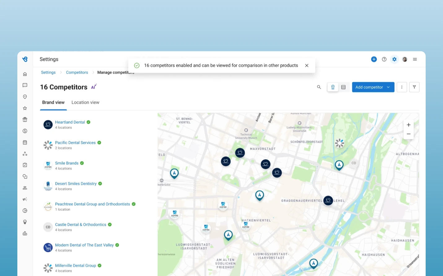
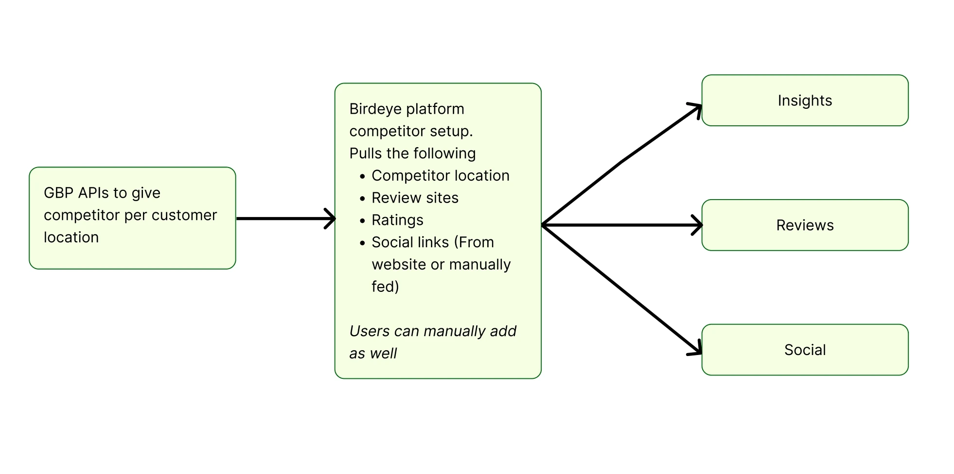
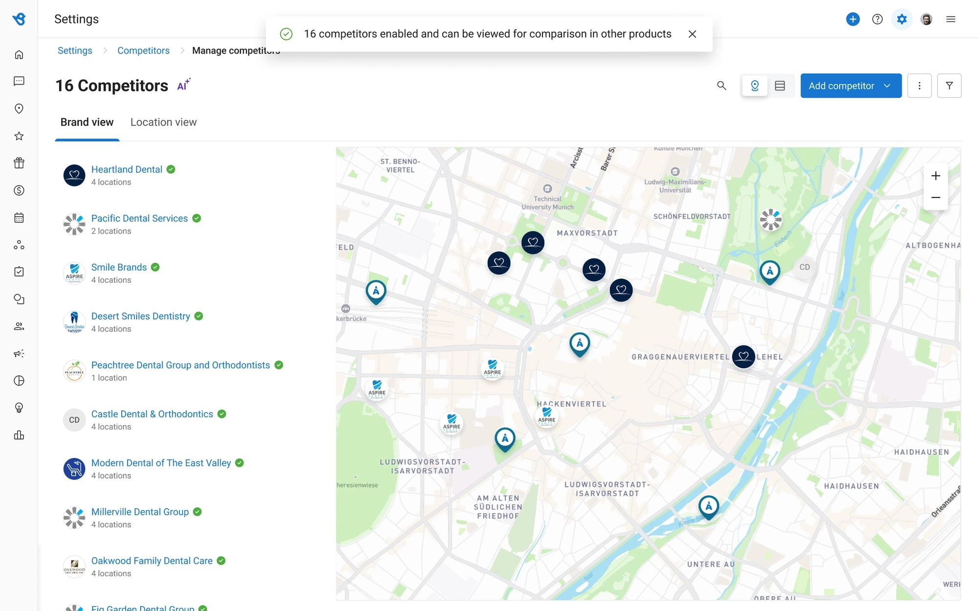
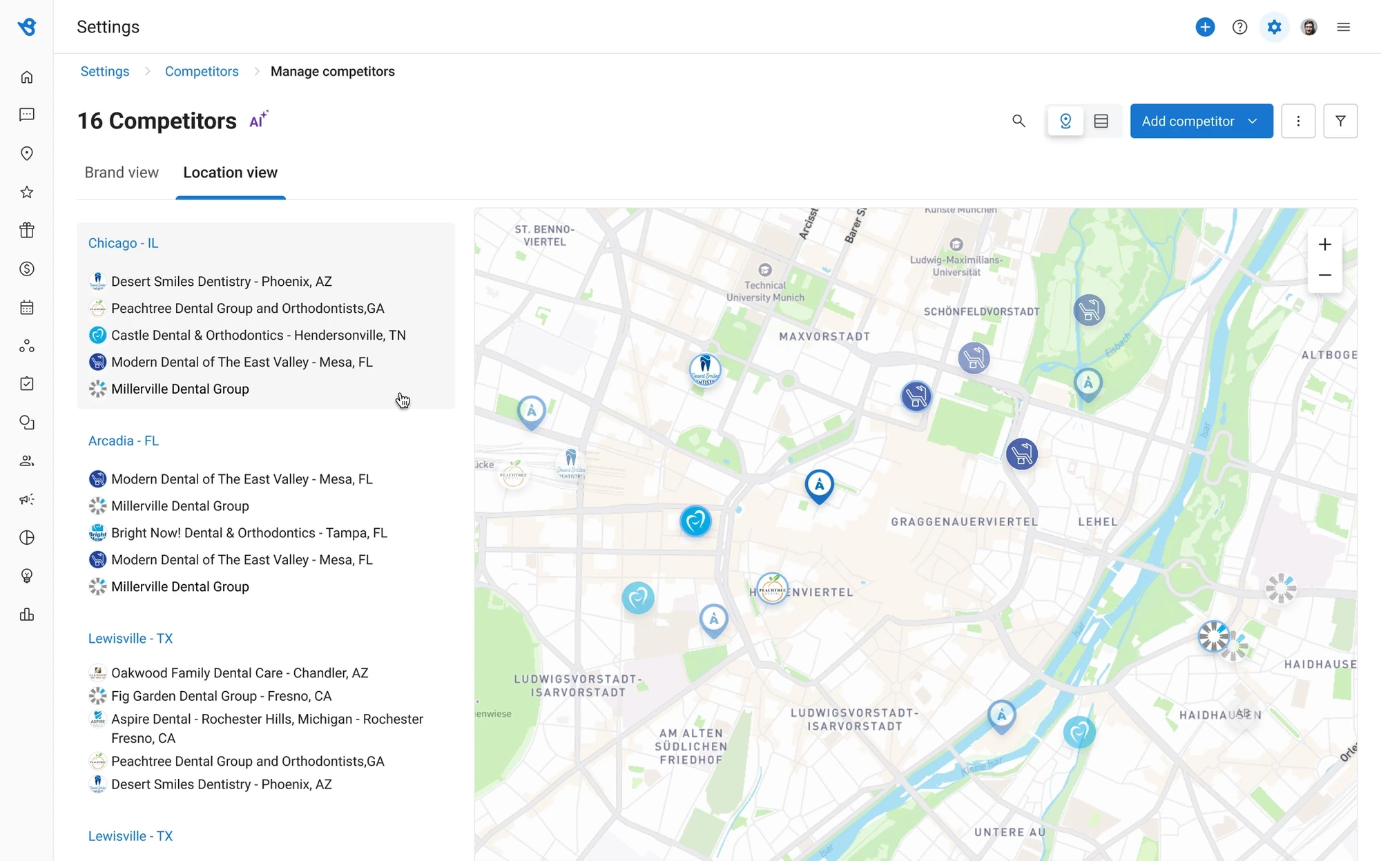
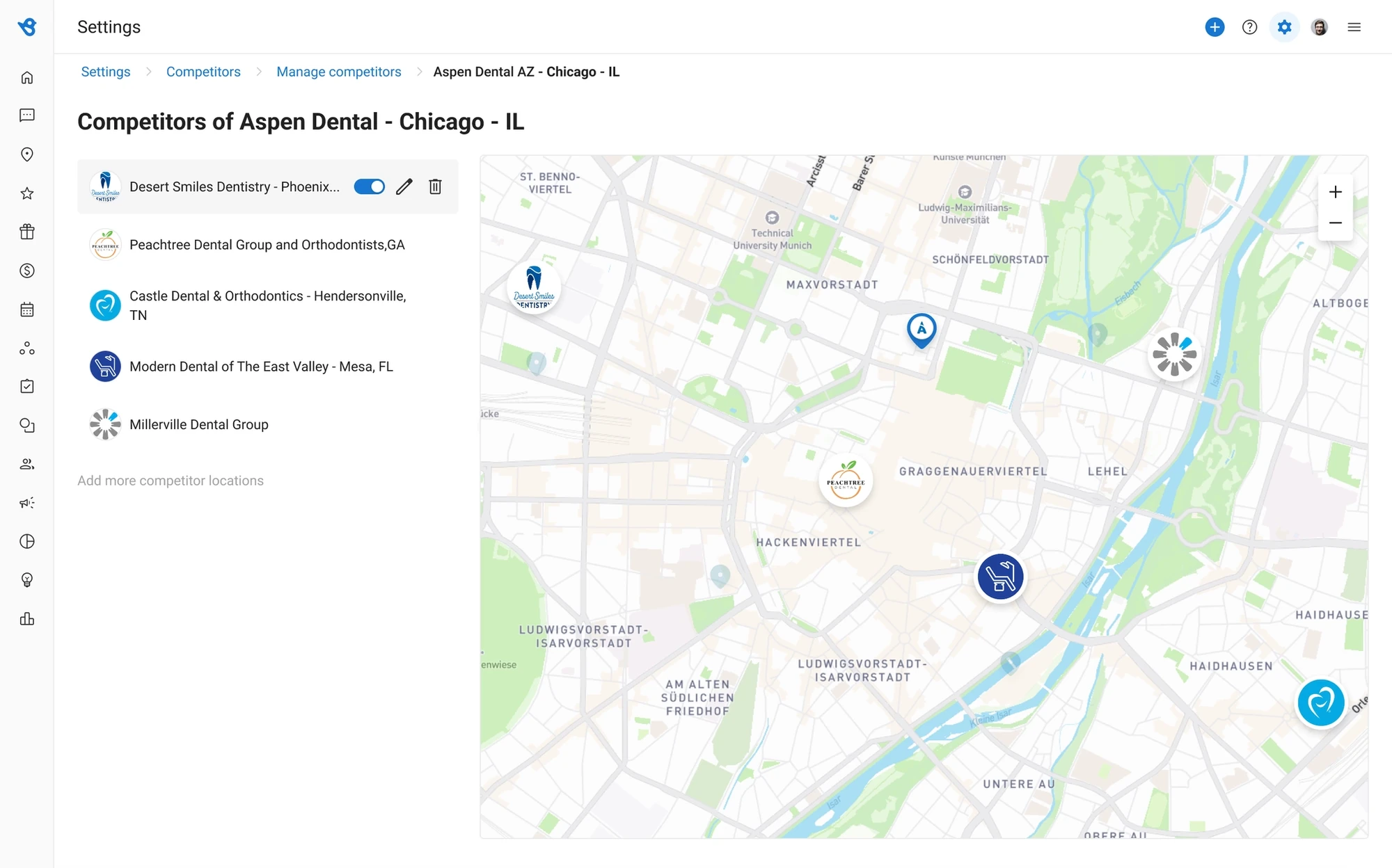
Competitors come in through Google Business Profile APIs, from the customer’s location. On by default. Brand view and location view. Manual add still exists, for the control, not as the front door.
Insights
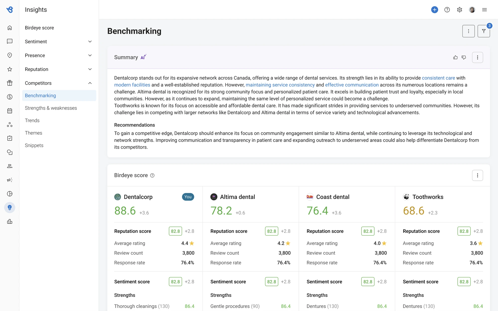
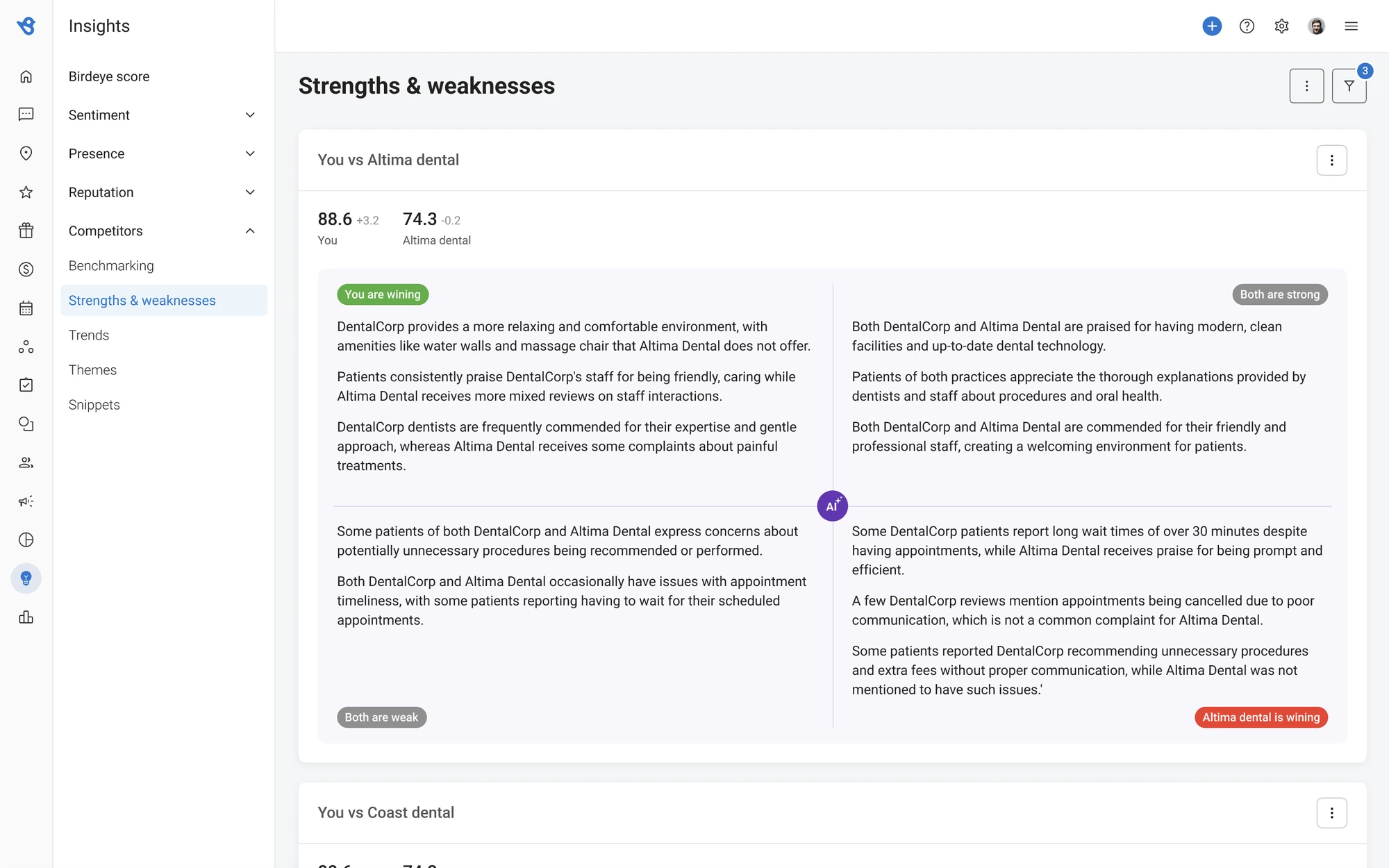
Comparative scores, AI summaries, a bubble of reputation versus sentiment, a strengths-and-weaknesses read, trends over time.
Reviews and Social
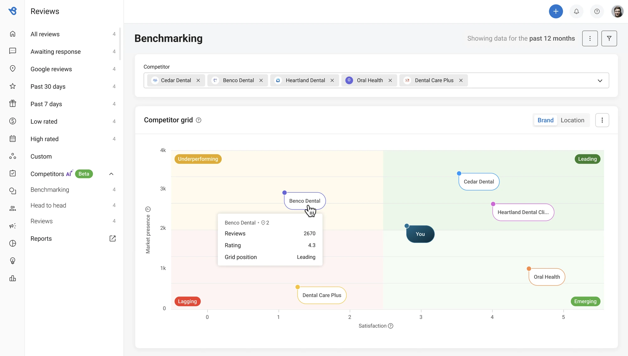
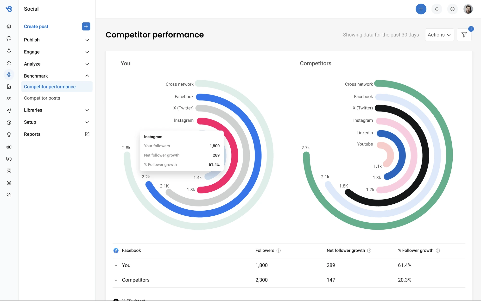
The same pattern again: grid, leaderboard by source, head-to-head. Social carries followers, growth, and engagement. One idea, learned once.
Asking a customer to configure competitors before they see value is asking them to churn before the product starts. Default-on was the adoption strategy. Repeating one pattern across four surfaces cut the learning curve and the engineering cost in the same move.
What changed
The friction that killed adoption was the setup.
The redesign removed the manual-setup tax by fetching competitors and turning them on. That was the adoption problem. The commercial frame is a stronger package with Insights: a real upsell, not a buried tab. No vanity metric here beyond that: the win we can stand behind is the product decision, not a number we don’t have.
What I’d tell another lead. If the SKU is a bundle, design the seam or the bundle is a slide. Default-on beats a preference panel. And one pattern across four surfaces is both a craft decision and a staffing decision.
The free bot, rewritten to be paid for.
Open it